Video Streaming App UI UX Case Study – Oyawatch
Introduction
This case study revolves around the transformation of Oyawatch, a subscription-based online video streaming application. Oyawatch caters to diverse users across devices, offering a seamless blend of live television and Video on Demand (VOD), bridging the gap for Nigerians overseas to enjoy home programs effortlessly.
Goal
The project’s overarching objective is to democratize access to favorite programs, movies, or shows, transcending social class and geographical constraints.
Research
A comprehensive survey of 100 participants, with 82 residing in Nigeria and 18 Nigerians living abroad, was conducted. Leveraging social media forums, we distributed survey forms and competitive interview questions to discern user pain points and preferences in video content streaming.
Some of the Questions Asked
1. How do you stay up to date with local happenings now that you are not in Africa?
2. Say your favorite program is airing when you are not home, how do you cope?3. Tell how you will act if the cost of cable TV is reduced by half?
We were able to gather broader information by throwing open questions. This allows the respondents to explain more, rather than give a simple yes or no answer.
Insights from the Research
User Persona
Based on research, goals, and target audience, three user personas were crafted. This foundational step paved the way for developing empathy maps to better understand user thoughts, feelings, and characteristics. Here is one:
After we’ve read the interviews and set a user persona, it’s time to make an empathy map.
Empathy Map for the Video Streaming App
One-user empathy maps and aggregated empathy maps, commonly referred to as “multiple-user empathy maps,” are the two different types of empathy maps. One-user empathy maps are made by converting the information from a single user’s interview into an empathy map, like in the reading’s earlier example. This strategy aids designers in putting the characteristics, feelings, and thoughts of a single user into a format that is simpler to collect data from.
Information Architechture
For users to successfully experience and interact with the app, we as UX designers must clearly arrange and classify the information that our design displays. Information architecture is the term used to describe this information organization process.
The three components of information architecture are as follows:
1. Organization: A product’s organization determines how various bits of information are connected.
2. Hierarchy: the main category is at the top, and subcategories that are connected to the main category are listed below.
3. Sequence: The sequence allows users to navigate an app by following specific stages or instructions.
Building a sitemap is aided by an understanding of hierarchy, organization, and sequence.
To ensure that customer pain points are adequately handled, each screen of the app is iterated. A quick list of the trending and most interesting channels and movies are our top priority on the home screen, we also provide contents to encourage user interaction.
The home screen is centered on elements that make users’ lives easier and also save them time because it was designed using user research. User engagement is increased by adding content about recent events and brand tales.
Low Fidelity Wireframes for Video Streaming App
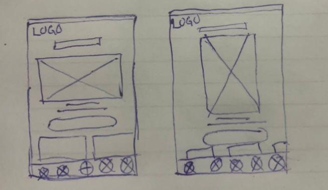
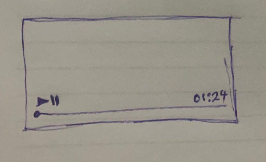
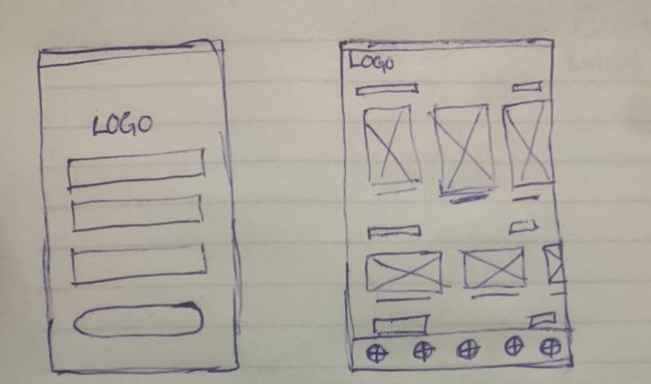
The app’s skeleton is represented by this visual wireframe.
Every page was designed in a way that the user’s pain points are well addressed.


A solely Live TV and movies page were also provided as well as a search and user profile page.
Design key moments for Video Streaming App
Home Screen
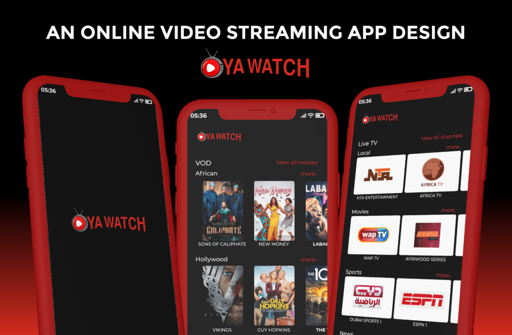
The homepage is structured in such a way that users can easily locate both Live TV and Movies without difficulty. By presenting the Most watched movies and trending channels on the home page, the user is already a step closer to the best Movies and Latest happenings around.
Live TV vs Movies Layout for Video Streaming App
We maintained the common practice which has shaped the user behaviour over years of consuming visual contents.
The Live TV images are presented in a Landscape mode which gives them more of the traditional television screen feel. Then the VOD(Movies and and Shows) have their images presented in portrait. This gives the user a feel they are already accustomed to, like done by Netflix, Rotten Tomatoes and IDMB. It also helps the user to easily differentiate a VOD from a Live Television Channel.
Color Palette
We used a 60-30-10 color principle for the project. The red representing energy and youth as well as keeping with the radiation of the best in the industry. The black represents mystery to keep users coming back every time for something new. The white, serves as the neutral clean to even things up.
Typography
Being a tech-driven product, we opted for the Montserrat font which is a Sans Serif.
These fonts are known for inducing an up to date and modern feeling to the user.
They are also tech-focused and cutting edge.
Conclusion
Users need easy to use applications. The app provides both local and overseas users an access to every content that they may need with a catch up on live television.
In the future, an improvement should be introduced where loyal users can be rewarded.
