UI UX Design is CRAP. Design Principle.
Crap simply means Contrast, Repetition, Alignment and Proximity. Not the crap you are thinking of. Follow along to learn how it can help make your designs better and more accessible.
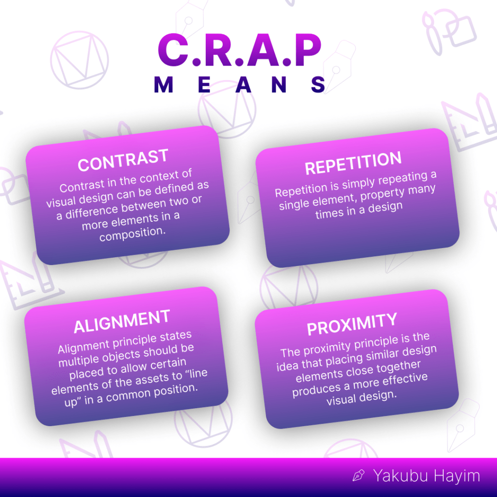
Contrast
Contrast is used to draw a user’s attention to particular aspects in a design and is all about making unique elements stand out. According to its definition, it is “the state of being remarkably distinct from anything else in comparison to or closely associated with”
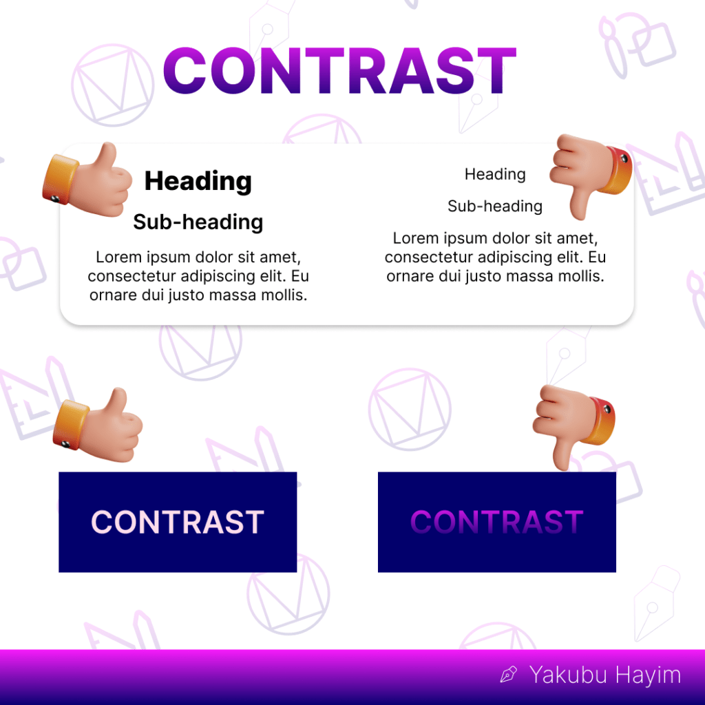
Contrast may only be available in black and white to the average person (or a similar combination of other colors). There is, however, much more to contrast. Along with distinct colors, contrast may also be created with various element types, forms, sizes, and a variety of other factors.
You can achieve a good contrast by carefully using different COLORS, FONT SIZES, TYPE, & SHAPES
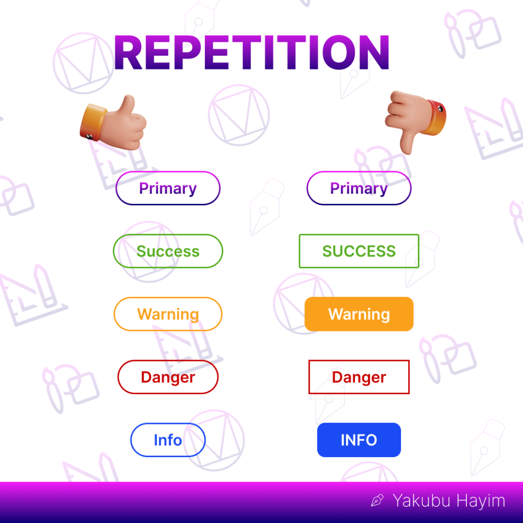
Repetition
The way to keep a design consistent is through repetition. It aids consumers in becoming accustomed to how information is presented to them. For instance, bullet lists show information by repeating round dots. The repeated dots make the list easier to scan and read rapidly. A design also develops its identity through the repetition of elements. The colors, shapes, textures, sizes, and other characteristics of the elements of a design can be used to practice repetition.
Alignment
The elements of a design are connected visually via alignment. For a neat and obvious design, you must avoid randomly positioning the pieces. Always check that your layout is in order to demonstrate order and remove distractions.
With alignment, no component of a design is placed at random. Each element in a design visibly relates to the others, creating coherence.
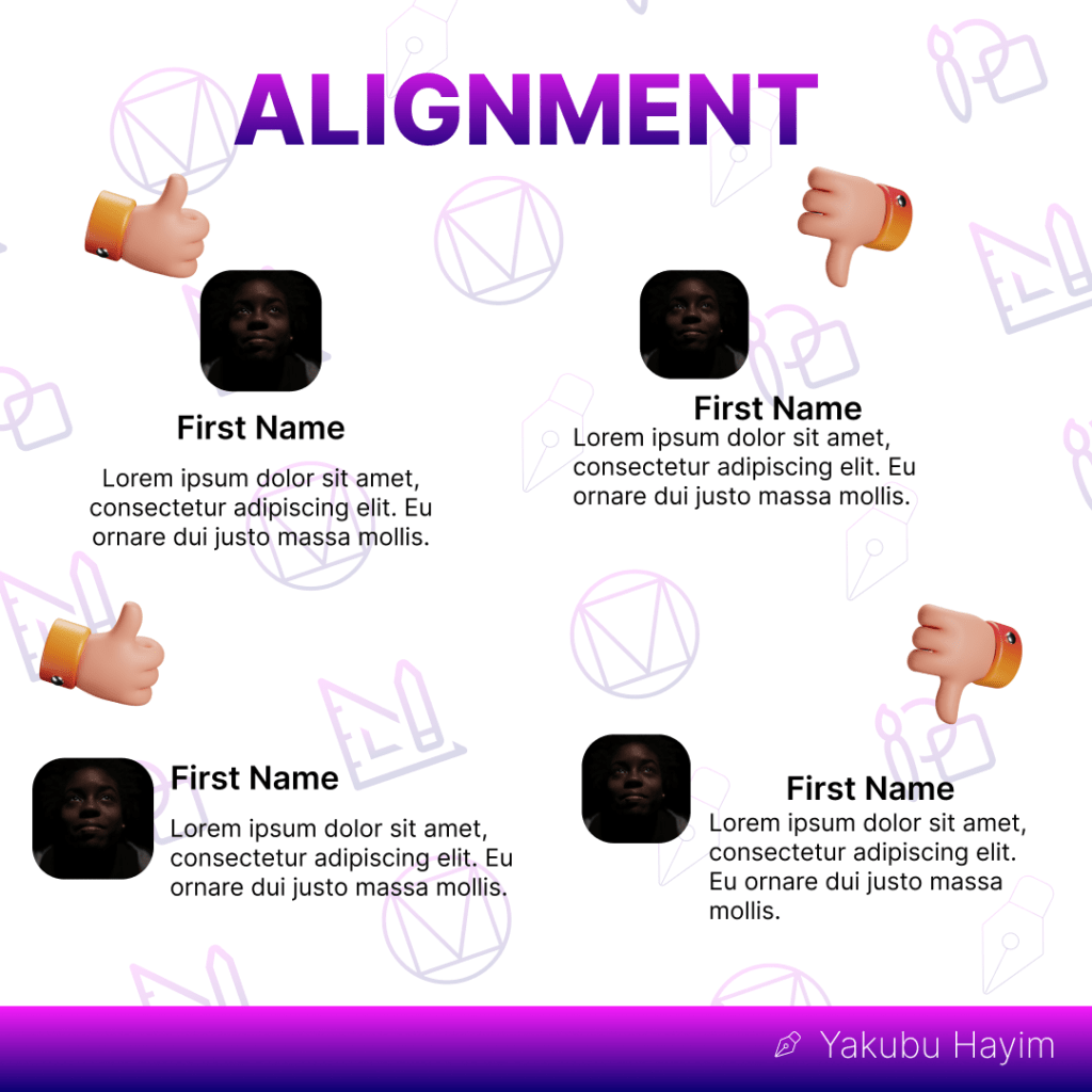
Edge alignment and center alignment are the two fundamental types of alignments.
Proximity
According to the principle of proximity, objects that are related to one another should be put close to one another (or grouped together), and the opposite is also true.
The use of proximity, particularly in online design, can improve user experience.
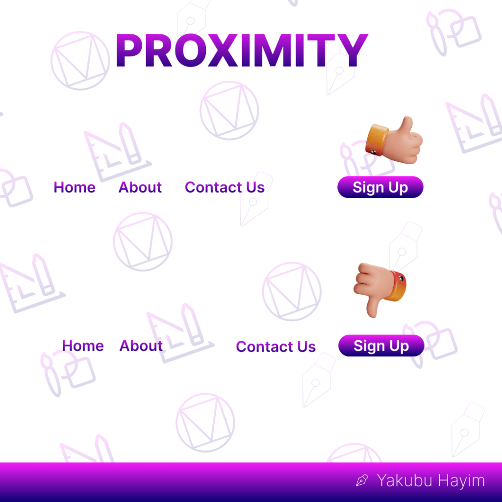
A novice designer could attempt to fill every square inch of a design with pieces by distributing them evenly. Users will have a tough time identifying elements that are connected to one another (and those that are not), which will lead to a bad user experience.
A good visual design will grab the audience’s attention within the first few seconds. You may develop more eye-catching graphic designs that also look more professional by using these straightforward but crucial ideas.
I hope you’ve learned and enjoyed reading about this short design principle called CRAP.
The less is more in Minimalist UX Design, find out why!
https://www.toptal.com/designers/digital-product-design/minimalist-ux-design-strategies
Click the button below to check more Design Blogs, Inspirations, and Tutorials from me
Some Sites Where I Drive Design Inspiration From:
