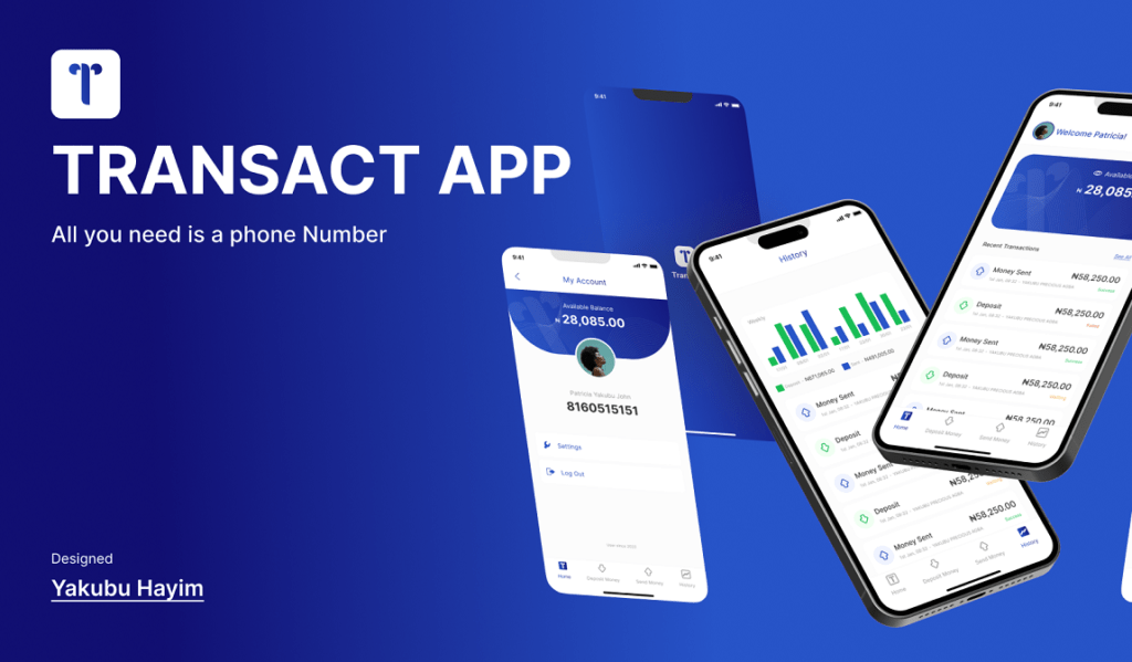
FinTech App UX Design Case Study – Transact
Figma Desgn: Transact App
Objective
Design a user-friendly banking app tailored for African users, focusing on seamless account management, transactions, and insightful visualizations.
Requirements for FinTech App UX Design
a. Users should be able to signup and login into their account.
b. Users’ phone number represent the account number.
c. Users should be able to deposit and send out money to others.
d. Users should be able to view a visualization that shows deposit and withdrawal history.
e. Users should be able to view the list of transactions. Also able to print out and share transactions.
UX Research and Design
Interview Question
How frequently do you use banking apps?
What challenges do you face while using existing banking apps?
Can you share your preferences regarding mobile app interfaces?
How comfortable are you with technology, especially in the context of banking?
What features do you consider essential in a banking app?
How do you typically manage and track your financial transactions?
Empathy Map
Says: Users express the need for a simple and intuitive banking app.
Thinks: Concerns about security and ease of use are dominant.
Feels: Desire for financial empowerment, frustration with complex interfaces.
Does: Regularly checks account balance, seeks straightforward transaction processes.
User Persona
Name: Amina
Age: 32
Occupation: Business Owner
Technology Proficiency: Moderate
Needs: Easy access, quick transactions, and transparent financial insights.
User Journey
Amina signs up easily using her phone number.
Amina deposits money effortlessly and sends funds to her business partner.
Amina explores visualizations to track her financial history.
Amina accesses the transaction list, prints, and shares it seamlessly.
Feature Prioritization
User Authentication: Seamless signup and login using the user’s phone number.
Deposit and Send Money: Intuitive features for depositing and sending money to others.
Transaction History Visualization: Clear visualizations depicting deposit and withdrawal history.
Transaction List and Printing: Accessible list of transactions, with the ability to print and share.
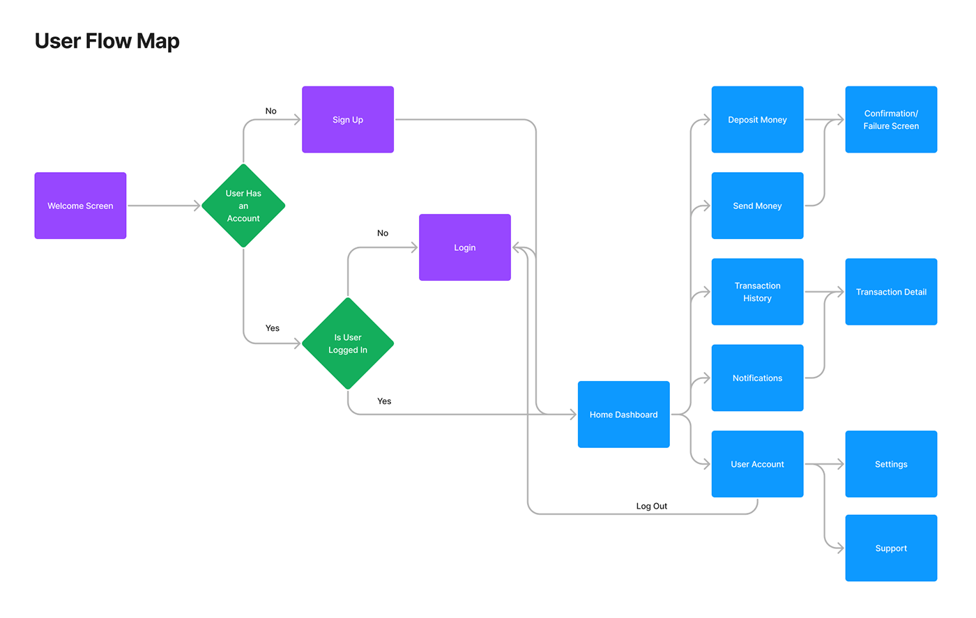
User Flow
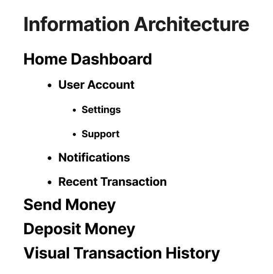
Information Architecture
UI Design and Prototyping
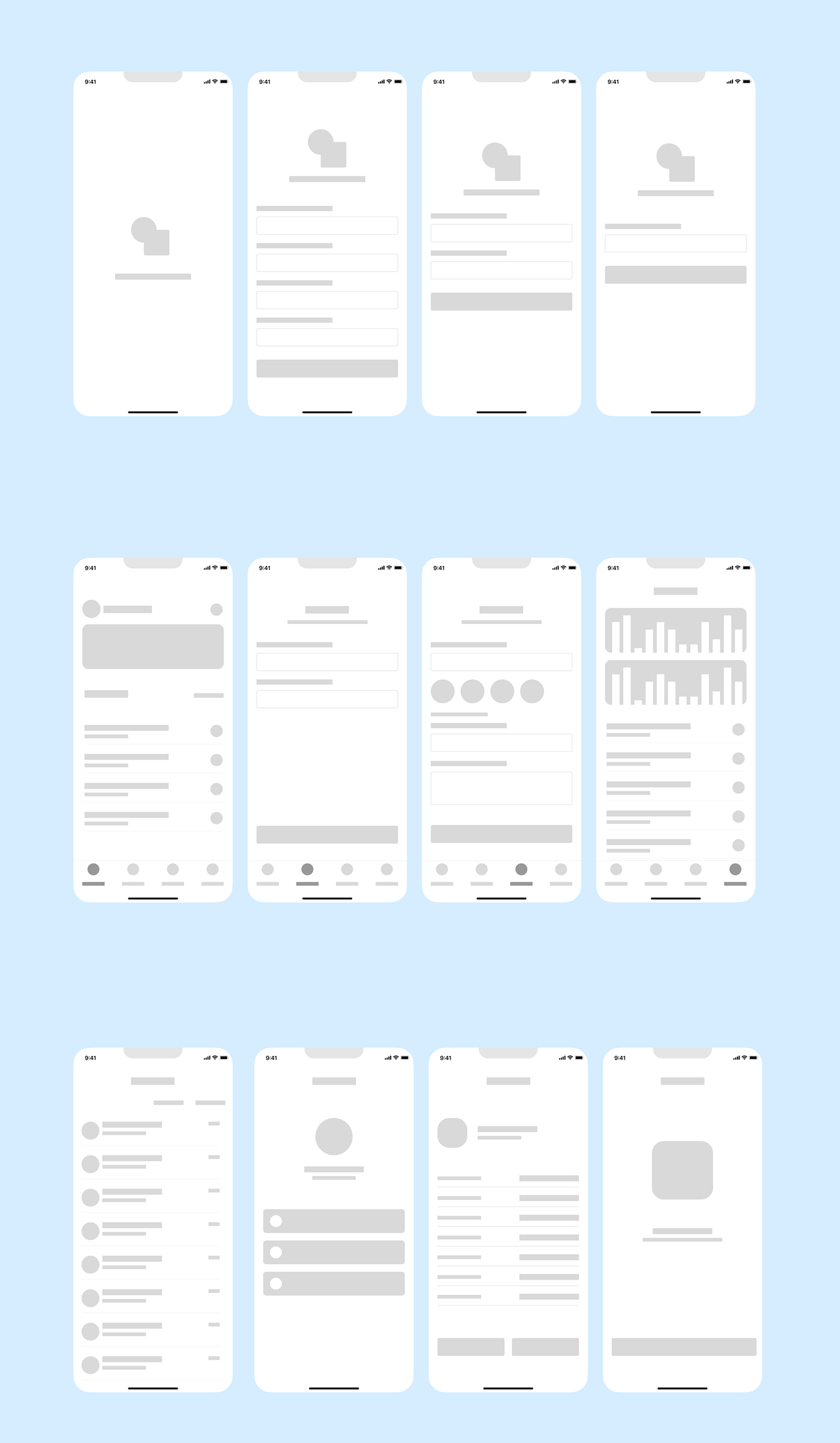
Wireframes
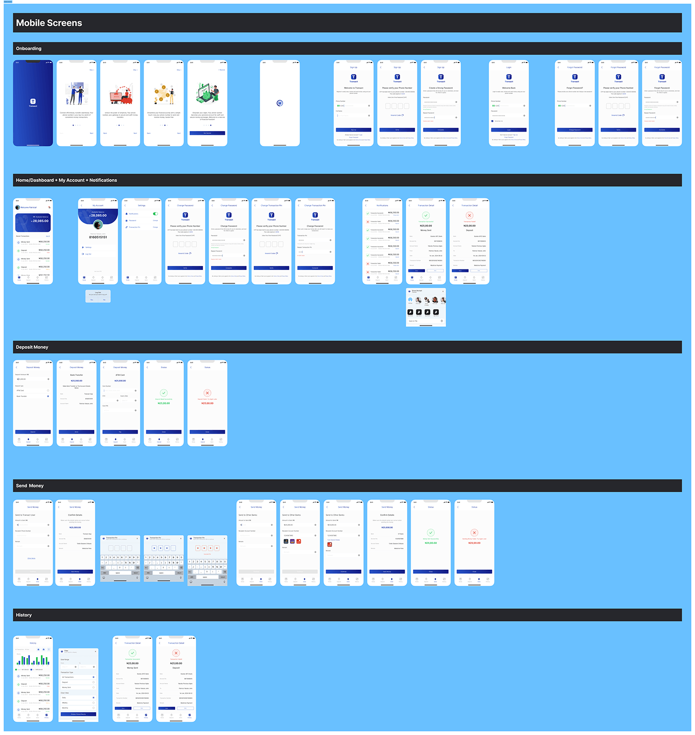
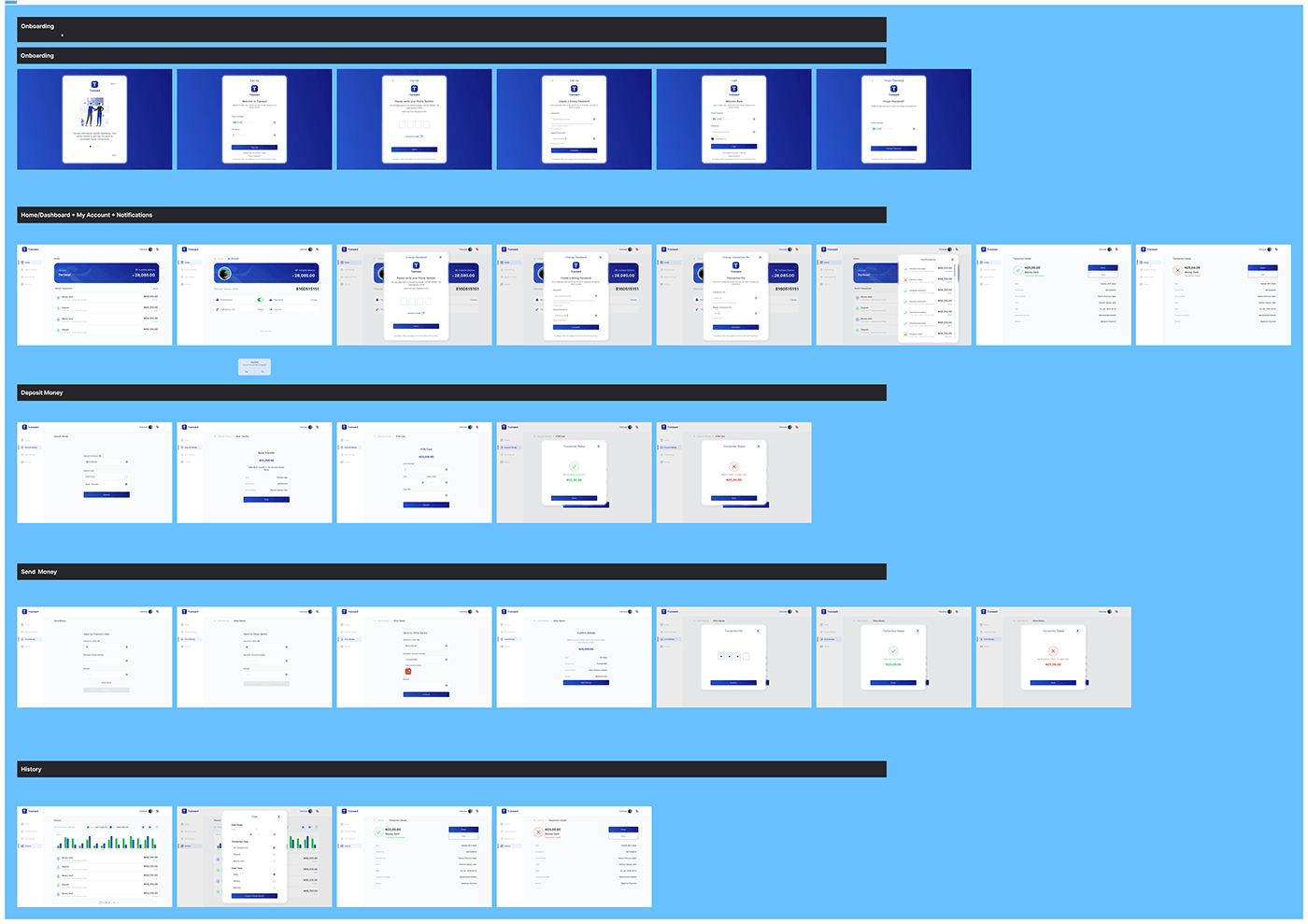
Streamlined signup and login screens.
Intuitive deposit and transfer interfaces.
Interactive visualization for transaction history.
Transaction list with print and share options.
Design Elements
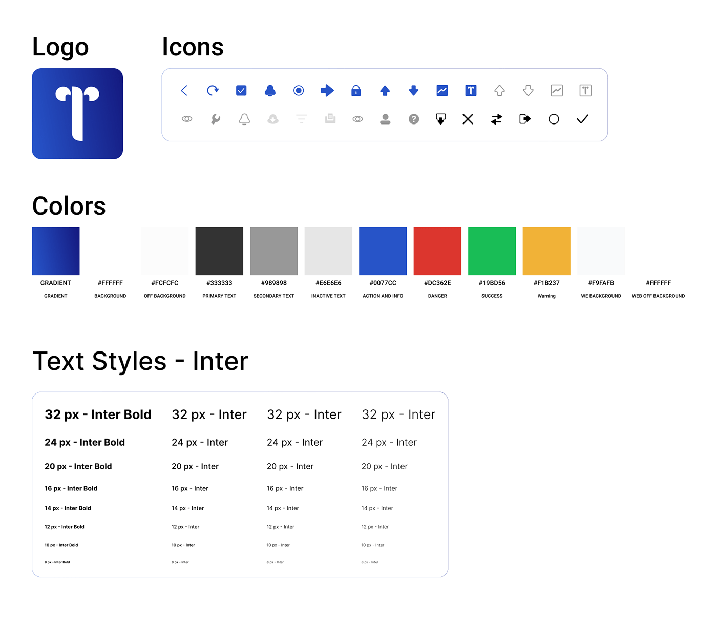
Inter Font
Legibility: Inter offers excellent legibility, crucial for a financial app where users need to read and comprehend information quickly.
Versatility: Inter’s versatility makes it suitable for various screen sizes, ensuring a consistent and pleasant reading experience.
Global Appeal: Inter’s neutral design contributes to a global and inclusive aesthetic, resonating well with a diverse user base.
Blue Gradient
Trust and Security: Deep blue gradients are often associated with trust and security, crucial in a banking app to instill confidence in users.
Cultural Sensitivity: Deep blue is a universally calming color and aligns well with cultural preferences, making it a suitable choice for a Nigerian user base.
Visibility and Readability: The strong gradient enhances visibility, contributing to a visually appealing interface while maintaining text readability.
Prototyping
Clickable prototype are developed to test the user flow, ensuring a seamless and intuitive experience.
Mobile Screens
Check the Figma Prototype Here
Desktop Screens
Check the Figma Prototype Here
Testing and Iteration
Participants
Usability tests were conducted with 5 participants, representing diverse demographics.
Tasks were prepared covering account setup, depositing money, sending money, exploring transaction history, and printing a transaction list.
Procedure
Participants were welcomed, the purpose explained, and they agreed to consent.
Participants with the app prototype and a set of tasks.
Their interactions were observed and recorded, paying attention to navigation, feedback, and overall user experience.
Participants were encouraged to think aloud and share their thoughts during the process.
After task completion, feedback through open-ended questions.
Usability Test Result for FinTech App UX Design
Common Findings
Positive Feedback on Signup/Login: Participants found the signup/login process straightforward, highlighting the use of phone numbers for simplicity.
Intuitive Deposit and Transfer: Users praised the ease of depositing money and sending funds, emphasizing the simplicity in these critical tasks.
Visualizations Appreciation: Participants valued the visualizations, expressing that they provided a clear and insightful overview of their financial history.
Transaction List Ease: Accessing the transaction list, along with printing and sharing options, received positive feedback for being user-friendly.
Areas of Improvement
Color Contrast: Some users suggested improving color contrast for better readability in certain sections.
Tooltip Clarity: A few participants recommended adding tooltips or explanatory messages for certain icons or features.
Confirmation Messaging: Enhancements in confirmation messages for transactions were suggested to provide users with more reassurance.
Conclusion on FinTech App UX Design
Transact offers a user-centric solution that aligns with Nigerian users’ preferences and needs. The app provides a secure, straightforward, and visually appealing platform for managing financial transactions, empowering users like Amina in their daily financial activities.
