Desktop vs Mobile UI Design Differences and Optimising UX
Owners and designers of websites are still catching up nowadays. They’ve spent the last ten years developing desktop design strategies, and the power has moved to those who understand mobile.


Understanding the differences between desktop and mobile app design and how to make the best of both is critical for entrepreneurs and designers alike. In this essay, we’ll go over some recommended practices for creating the optimal user experience.
Desktop vs Mobile UI Design Differences
Size
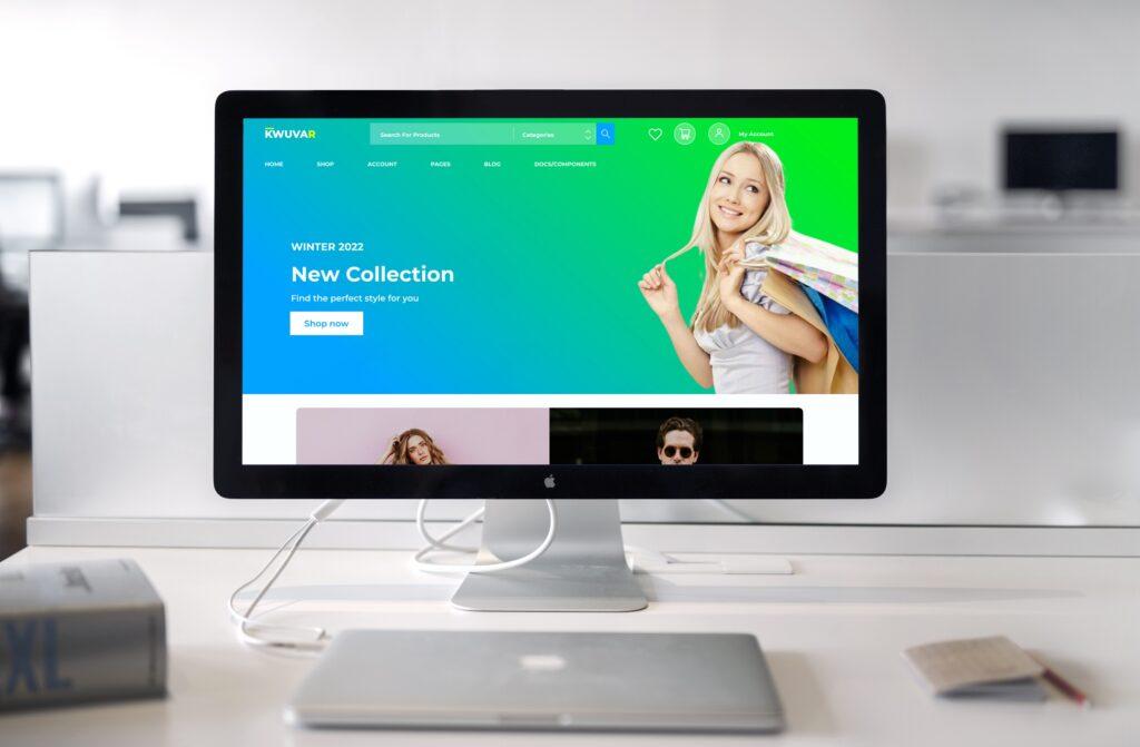
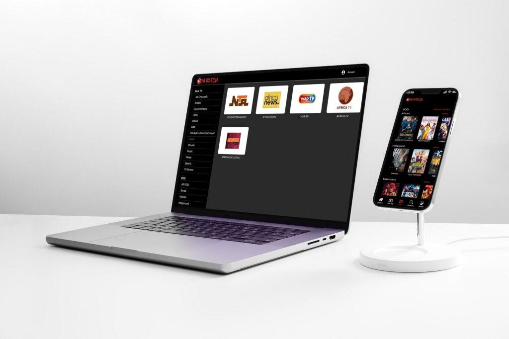
Desktop is Large: This entails far more than the ability to add new items. All aspects of design, notably navigation, are affected by screen size. Fixed navigation bars are possible in desktop programs, while pull-out menus are the norm on smartphones. Users may discover new portions they were previously unaware of, which helps with discoverability. Did you know that eBay sells motors and other auto parts, for example? You’d have to go out of your way to understand that if you used their mobile app.

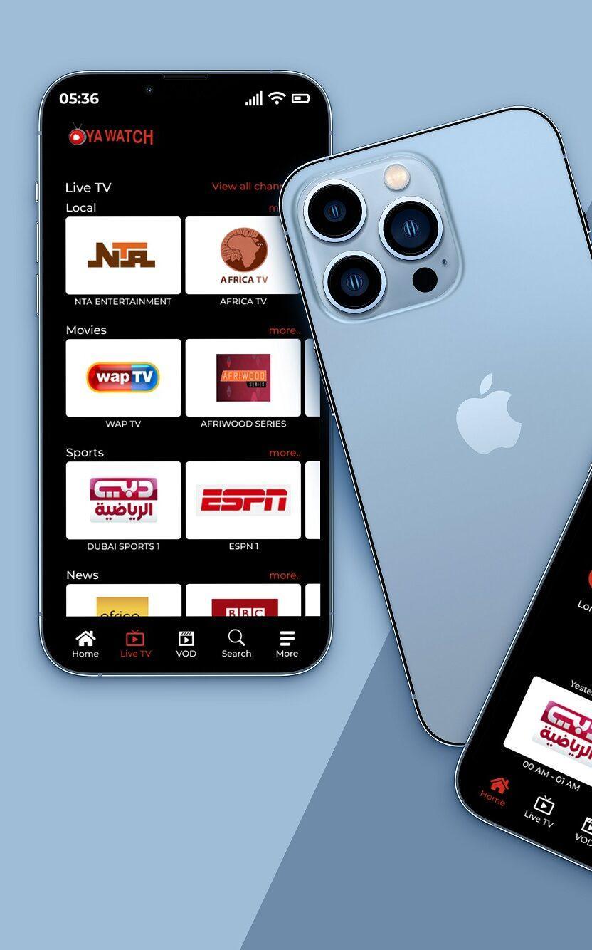
Mobile is Smaller: Because mobile apps must save screen space wherever possible, you must know which elements are significant enough to display. This stumbling block spawned two interesting trends: minimalism and the hamburger menu. Both were so popular that they made their way into desktop design, where they’re more of a fashion statement than a need.
Interactions
Desktop Use Cursor: Cursor interactivity in desktop software can include things like hover text and cursor-triggered animations. This allows desktop apps to have entire panels dedicated to photographs, with descriptive text appearing only when the user hovers over them.
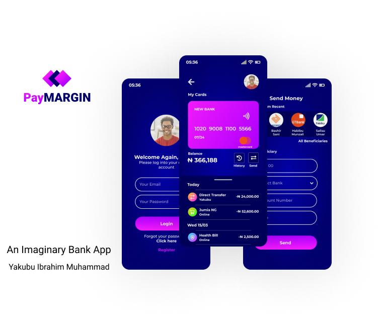
Mobile Use Gestures: On mobile apps, you can’t hover or rollover, but you have an infinite number of motions at your disposal. Swiping, shaking, and good old fashioned poking open up a whole new world of possibilities for apps (and they make them more fun). Consider how tedious Tinder would be if you had to click.
Organising Content
Desktop Support Columns: On the desktop, any material can be displayed in a typical multi-column format, exactly like in newspapers and magazines. This gives you a lot of freedom when it comes to building layouts and placing text, graphics, and UI elements.
Mobile is More Vertically Scrolled: Mobile apps must use lengthy scrolling whenever content reaches a specified length. This isn’t a terrible thing! Continuous scrolling is actually preferred by mobile users, and it saves screen space while making interaction more entertaining using gestures. Long scrolling, like minimalism and the hamburger menu, is another popular mobile design trend that has made its way to the desktop.

Functionality
Big Tasks for Desktop: Users prefer desktop apps for lengthier, more involved tasks, according to the results of a Gallup Panel survey. One reason is because the amount of functions available on mobile displays is limited. That’s one of the reasons Adobe chose a hybrid Photoshop Mix app rather transferring the entire Photoshop suite to mobile. But more to the point, it’s about the mentality. Mobile works for short spurts and quick tasks that come up in the moment (think price comparisons or proving your friend wrong about who plays the Hound in GoT). When longer tasks come up, users would rather find a seat and settle in to desktop apps with more functions, more content, and more special features.
Mobile is More Experimental: Mobile makes up for its lack of utility with inventiveness. Mobile design is currently at the forefront of technology, with a slew of unique features that desktop computers just cannot match.
Here’s just a few examples:
- Virtual reality
- Augmented reality
- Multiple cameras
- Accelerometers and gyro sensors
- Mobile contact lists
- Magnetic sensors
It’s not always new tech either. Sometimes apps can use existing tech in new ways. For example, Snapchat makes use of your phone’s accelerometer to know when you’re driving, and switches to a bitmoji car.
That is all for today. Stay tuned for more upcoming blogs. You can also check more design related blogs here.