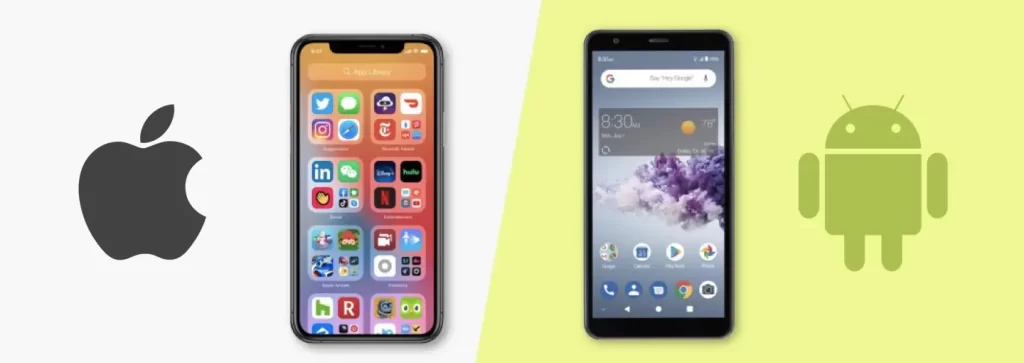
Considerations for iOS vs Android Design. In the ever-evolving world of UX design, creating seamless and user-friendly experiences across different platforms is a skill that sets seasoned designers apart. With seven years of experience in the field, I’ve encountered and overcome various challenges in designing for both iOS and Android. In this blog post, we’ll delve into the most crucial considerations when crafting designs for these two dominant mobile operating systems.
1. Design Guidelines:
- iOS: Embrace the Human Interface Guidelines (HIG), focusing on clarity, depth, and deference to content.
- Android: Adhere to Material Design principles, emphasizing material surfaces, intuitive navigation, and consistent UI patterns.

2. Navigation Patterns:
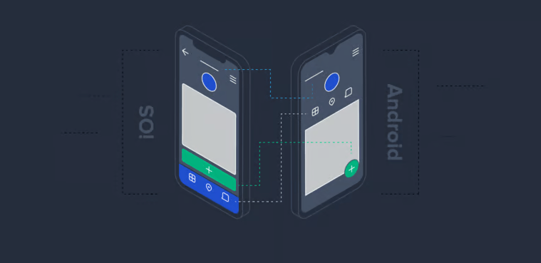
- iOS: Utilize the navigation bar and tab bar for clear hierarchies, employing gestures like swipe-back for seamless transitions.
- Android: Leverage the app bar, bottom navigation, and drawer navigation, with emphasis on the Back button for user flow.
3. Typography and Iconography:
- iOS: Prioritize the use of San Francisco as the default font, and adhere to Apple’s iconography for a cohesive look.
- Android: Choose Roboto as the primary font, and utilize adaptive icons to ensure visual consistency across different devices.
4. Device Fragmentation:
- iOS: Design for a limited range of devices, ensuring a more standardized experience.
- Android: Account for a diverse range of screen sizes and resolutions, implementing responsive design principles.
5. Interaction Models:
- iOS: Capitalize on 3D Touch and haptic feedback for a tactile experience.
- Android: Leverage long-press interactions and explore the potential of the diverse array of Android devices with varying input methods.
6. Color Palette:
- iOS: Use a consistent color scheme throughout the app, focusing on subtle gradients and translucency effects.
- Android: Embrace vibrant colors in line with Material Design, ensuring a visually engaging experience.
7. User Flow and Information Architecture:
- iOS: Streamline user journeys, utilizing modal presentations and ensuring clear information hierarchy.
- Android: Emphasize bottom navigation and maintain a logical information architecture with a focus on intuitive task flow.

In Summary:
| Aspect | iOS | Android |
|---|---|---|
| Design Guidelines | Human Interface Guidelines (HIG) | Material Design |
| Navigation Patterns | Navigation bar, tab bar, swipe-back | App bar, bottom navigation, Back button |
| Typography | San Francisco | Roboto |
| Device Fragmentation | Limited range of devices | Diverse screen sizes, responsive design |
| Interaction Models | 3D Touch, haptic feedback | Long-press interactions, device diversity |
| Color Palette | Consistent, subtle gradients | Vibrant, Material Design colors |
| User Flow | Modal presentations, clear hierarchy | Bottom navigation, logical architecture |
Designing for iOS and Android requires a nuanced understanding of their respective guidelines, user behaviors, and technical nuances. By carefully considering these key aspects, designers can create applications that seamlessly integrate with the unique characteristics of each platform, ultimately providing users with a delightful and cohesive experience.
Connect with Us:
Linkedin
Twitter
Behance
Get Free Figma Resources:
Figma Resources
Learn More on Design:
Design Blog