Data Visualization in Modern UI Design: Enhancing User Experiences through Visual Storytelling
Introduction
In the realm of modern UI design, data visualization has emerged as a powerful tool for communicating complex information in a visually engaging and easily digestible format. As digital interfaces become increasingly data-driven, the ability to present information effectively has become a crucial aspect of user experience (UX) design. In this comprehensive guide, we will explore the role of data visualization in modern UI design, its importance, best practices, and how it contributes to enhancing user experiences through visual storytelling.
Understanding Data Visualization
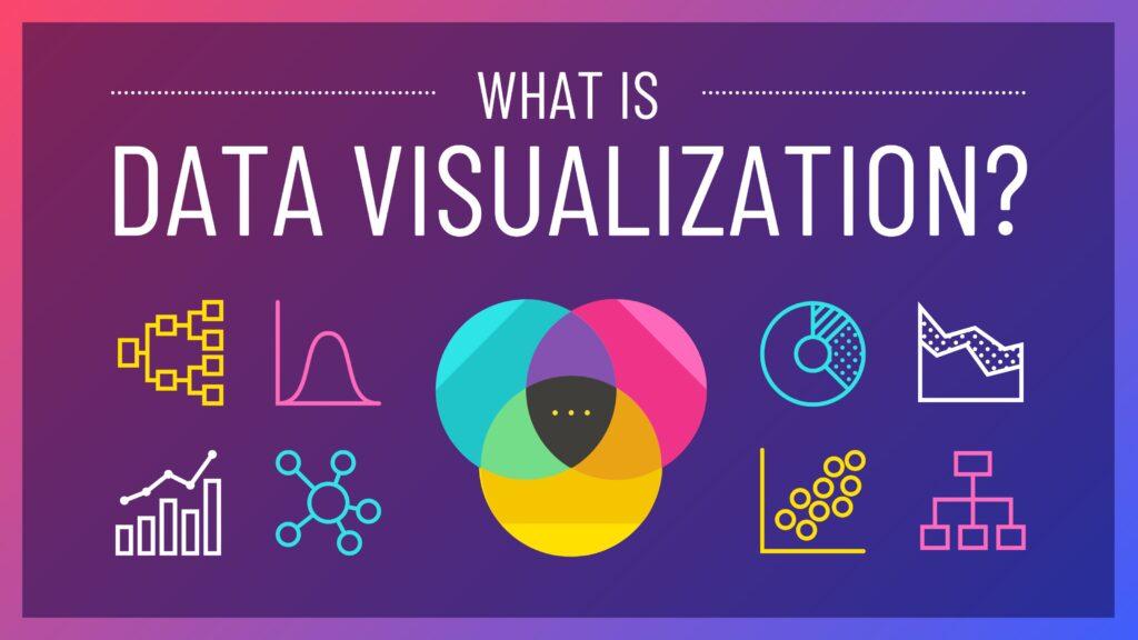
Data visualization is the graphical representation of information and data. It transforms raw data into meaningful visual forms such as charts, graphs, maps, and infographics, making it easier to identify patterns, trends, and insights. In the context of UI design, data visualization serves as a bridge between users and complex datasets, enabling them to make informed decisions and derive actionable insights.
The Importance of Data Visualization in UI Design
- Enhanced Understanding: Visual representations of data enable users to grasp complex concepts more quickly and intuitively than textual or numerical formats alone.
- Improved Decision Making: By presenting data in a visually compelling manner, UI designers empower users to make informed decisions based on accurate insights and trends.
- Engagement and Retention: Well-designed data visualizations capture users’ attention and encourage them to explore and interact with the interface, leading to increased engagement and retention.
- Brand Identity and Recognition: Consistent use of data visualization styles and patterns can contribute to a cohesive brand identity, reinforcing brand recognition and trust among users.
Best Practices for Data Visualization in UI Design
- Understand Your Audience: Prioritize the needs and preferences of your target audience when designing data visualizations. Consider their level of expertise, cognitive abilities, and preferred interaction patterns.
- Choose the Right Visual Representation: Select appropriate chart types and visual elements that effectively convey the intended message and facilitate easy comprehension. Match the complexity of the data with the complexity of the visualization.
- Maintain Visual Clarity and Simplicity: Avoid clutter and unnecessary embellishments that may distract users or obscure the underlying data. Use whitespace, color, and hierarchy to guide users’ attention and focus.
- Ensure Accessibility and Inclusivity: Design data visualizations with accessibility in mind, ensuring that they are perceivable, operable, and understandable for users with diverse abilities. Provide alternative text descriptions and interactive elements for screen readers and assistive technologies.
- Optimize for Performance: Prioritize performance optimization to ensure smooth rendering and interaction across different devices and screen sizes. Consider the scalability and responsiveness of data visualizations, especially in dynamic and real-time applications.

Examples of Effective Data Visualization in UI Design
- Interactive Dashboards: Dashboards that display key metrics and performance indicators in real-time, allowing users to customize views and explore data through interactive filters and drill-downs.
- Geospatial Mapping: Maps and geospatial visualizations that plot data points on geographic regions, enabling users to analyze spatial patterns and make location-based decisions.
- Time-Series Charts: Line graphs and area charts that visualize trends and changes over time, facilitating historical analysis and forecasting.
- Hierarchical Tree Maps: Tree maps that represent hierarchical data structures, such as organizational hierarchies or file directory structures, in a nested and visually intuitive format.
Conclusion
In conclusion, data visualization plays a pivotal role in modern UI design by transforming complex datasets into meaningful insights and compelling narratives. By embracing best practices and leveraging the power of visual storytelling, UI designers can create interfaces that engage users, facilitate informed decision-making, and enhance overall user experiences. As technology continues to evolve, the role of data visualization will undoubtedly remain central to the design process, driving innovation and shaping the future of user-centered design.
Remember, effective data visualization is not just about aesthetics; it’s about empowering users with knowledge and enabling them to interact with information in meaningful ways. By mastering the art of data visualization, UI designers can unlock new possibilities and create experiences that resonate with users on a deeper level.
Stay tuned for more insights and trends in the ever-evolving landscape of UI design and data visualization.
Thank you for reading!
