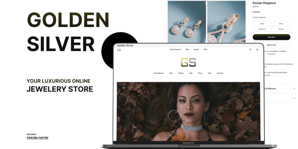
Online Luxury Jewelry Store: Golden Silver. an Ecommerse for the Rich
Introduction
Background: Golden Silver is an upscale online jewelry store catering to first-class customers. The store offers a diverse range of luxurious jewelry, including necklaces, watches, earrings, and bracelets made of gold, silver, and diamonds for men, women, and kids.
Objective: Create an immersive and user-friendly online experience that reflects the brand’s exclusivity while ensuring the website is accessible and usable for a wide audience.
Research and Discovery
User Persona: Meet Emma, our primary user persona. Emma is a 35-year-old successful professional who appreciates the finer things in life. She values exclusivity and is looking for high-quality, luxurious jewelry for herself and her family. Emma is tech-savvy, but her time is precious, so the website should provide a seamless and efficient shopping experience.
Competitor Analysis: In our competitive landscape, we’ve analyzed leading luxury jewelry websites like Tiffany & Co. and Cartier. We observed that clear product imagery, intuitive navigation, and a sense of exclusivity are key elements. Golden Silver aims to differentiate by combining a sleek design with a personalized touch, offering exclusive collections for men, women, and kids.
Accessibility and Usability: Our research shows that 15% of online shoppers have some form of disability. To ensure inclusivity, Golden Silver will prioritize accessibility features. This includes implementing high color contrast for readability, using clear and concise alt text for images, and ensuring keyboard navigation for users who rely on it. Regular usability testing, including sessions with participants with disabilities, will be conducted to refine the user interface.
Design Process
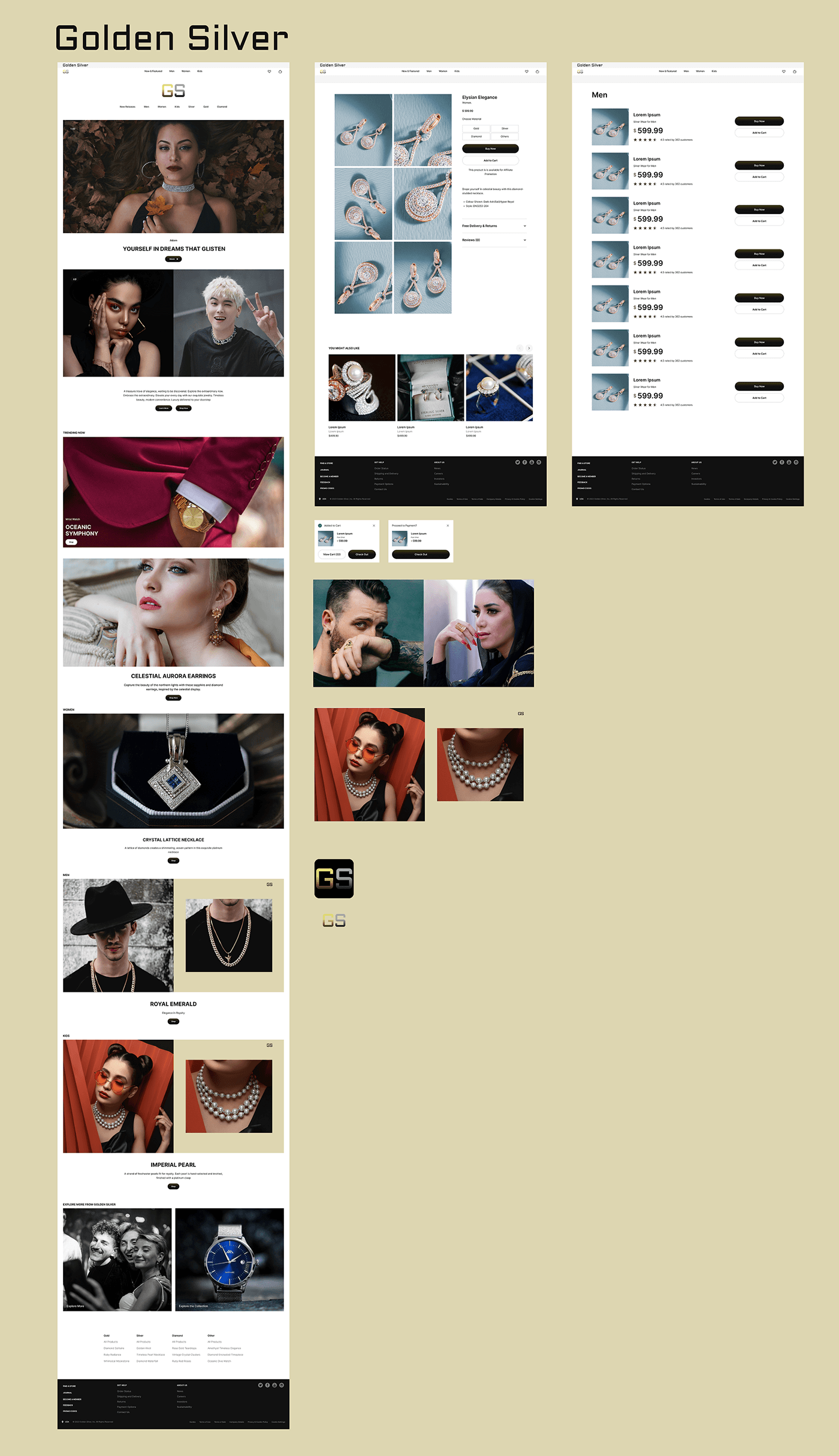
Wireframing: Based on user feedback and competitor analysis, wireframes have been created in Figma. The wireframes focus on a clean and intuitive layout, ensuring that the navigation is straightforward, and users like Emma can easily find the jewelry they desire.
Style Exploration: After exploring various color schemes and typography options, the design team has chosen a palette that exudes sophistication—combining gold and muted tones. The typography is elegant and easily readable. High-resolution images from Unsplash and Pexels showcase the intricate details of the jewelry.
Figma to Webflow Transition: The transition from Figma to Webflow has been seamless, thanks to the “Figma to Webflow” plugin. The development team is ensuring pixel-perfect accuracy in rendering the UI elements, maintaining the integrity of the design across all devices.
High Fidelity Design
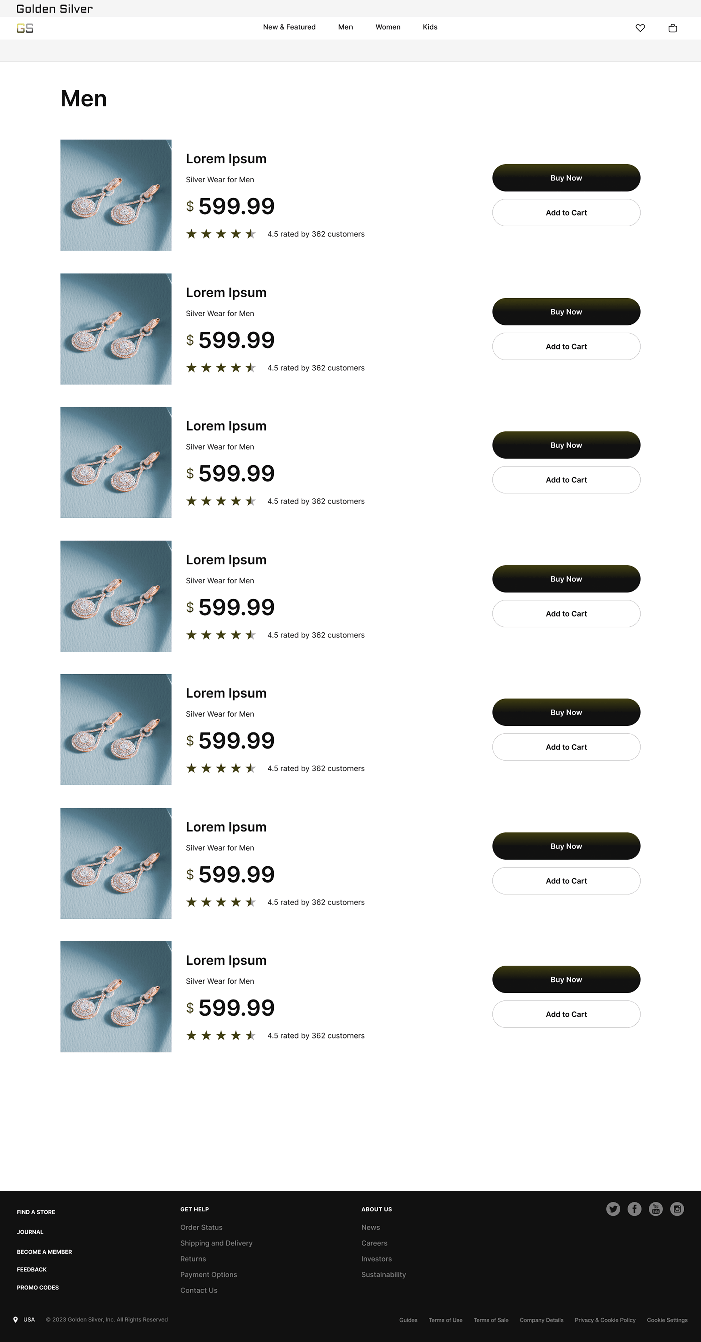
Home Page: The homepage features a visually striking hero section with Emma’s favorite jewelry pieces, inviting her to explore further. The navigation menu is minimalistic yet comprehensive, allowing Emma to effortlessly browse different product categories. A prominent search bar enhances quick product discovery.
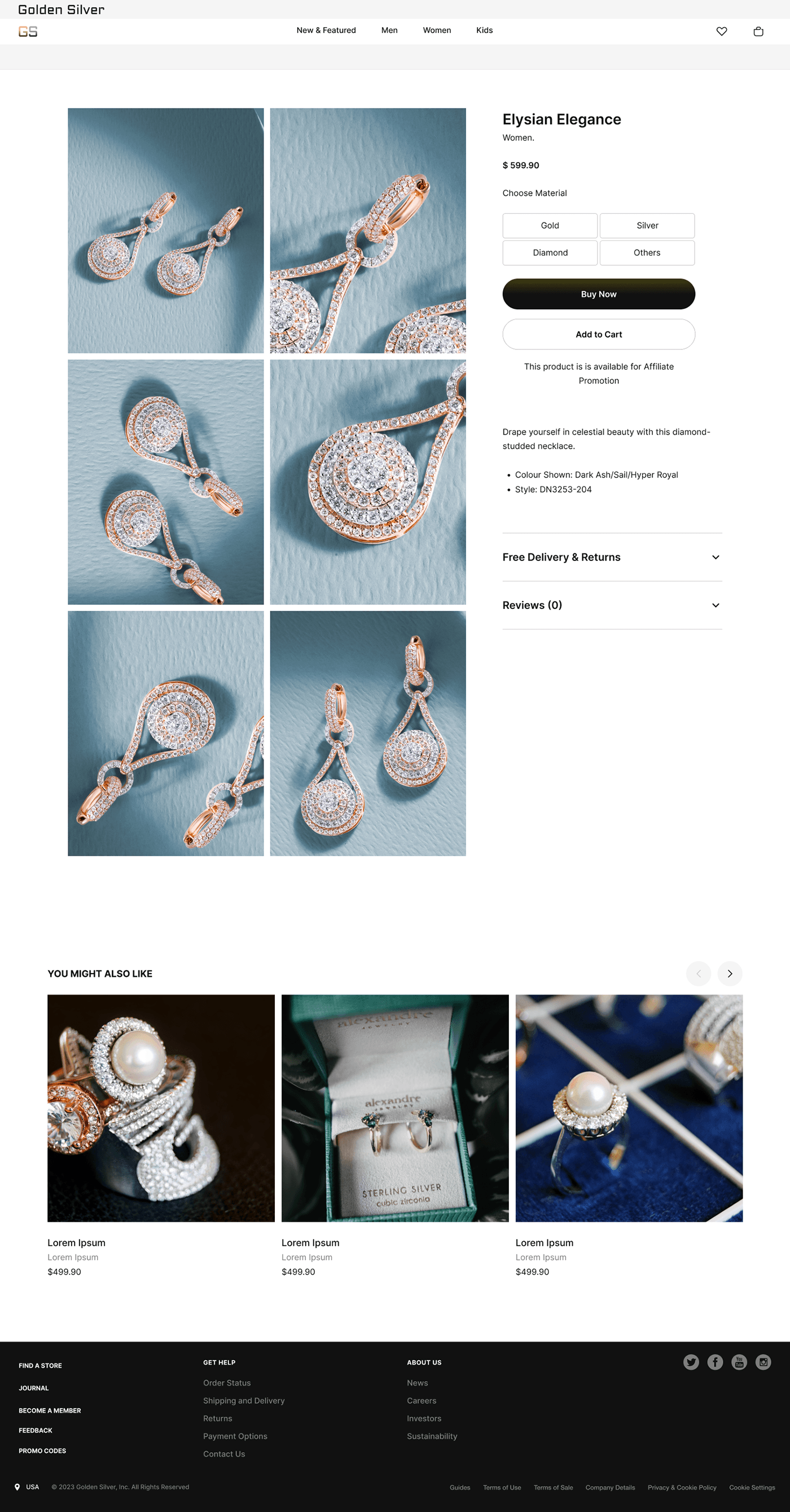
Product Pages: Each product page maintains a clean and minimalistic design, providing detailed product descriptions, sizing information, and multiple high-resolution images. The “Quick View” option ensures a streamlined browsing experience for users like Emma.
User Account Dashboard: Emma’s personalized dashboard allows her to track orders, manage wishlists, and save preferences. This tailored experience strengthens the connection between Emma and Golden Silver, fostering brand loyalty.
Accessibility Features: Color contrast and readability have been optimized for users with visual impairments. Keyboard navigation and focus states ensure a smooth experience for those relying on screen readers. Alt text for images is carefully crafted to enhance accessibility.
Check the Design on Figma Community

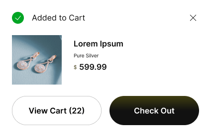
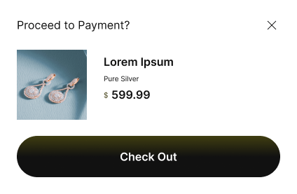
Developement and Launch of Online Luxury Jewelry Store
Webflow Development: Collaborating closely with developers, the design is being implemented on Webflow. Performance optimization and responsive design are top priorities to guarantee a flawless experience on various devices.
Testing: Thorough testing covers browser compatibility, responsiveness, and accessibility compliance. Any issues identified during testing are promptly addressed, ensuring the website meets the highest standards.
Results of Online Luxury Jewelry Store Developement
Launch: The Golden Silver website is now live at [https://goldensilver.webflow.io/], providing an exceptional online shopping experience for users like Emma who seek both luxury and usability.
Feedback and Iteration: User feedback and analytics data are continuously monitored. Regular iterations based on this feedback are implemented to enhance user satisfaction and address evolving needs, solidifying Golden Silver’s commitment to excellence.
