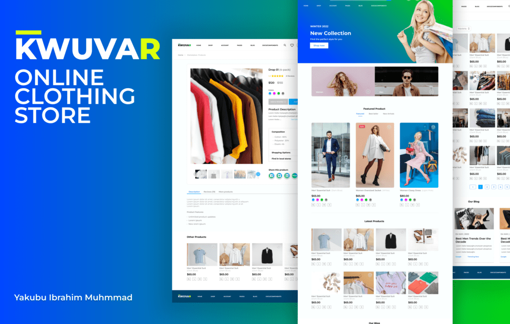
Ecommerce Store UI UX Design Case Study to Improve Experience
Background
Kwuva Clothing, faced with low conversion rates and high bounce rates, sought our expertise to enhance user experience and bolster sales.
Problem Statement
The main problem lay in users struggling to locate desired products, compounded by a confusing and cluttered website navigation. Subpar product images and a lack of mobile optimization further exacerbated the challenges.
Contribution

Research Analysis
Our approach involved comprehensive user research, encompassing interviews with existing and potential customers, coupled with an in-depth analysis of website analytics to discern user behavior and identify optimization opportunities. The findings indicated user difficulties in product discovery, navigation, dissatisfaction with image quality, and sluggish mobile responsiveness.
User Personas
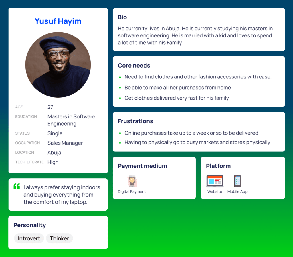
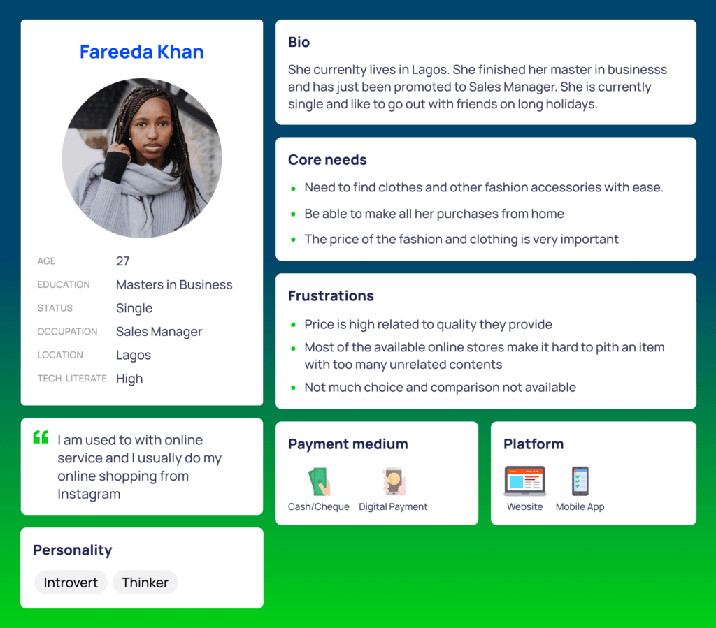
From our research, we found that users were having difficulty finding specific products and navigating the website. Additionally, they were not impressed with the quality of the product images and found the website to be slow and unresponsive on mobile devices.
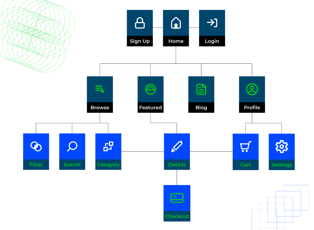
Information Architecture
Design
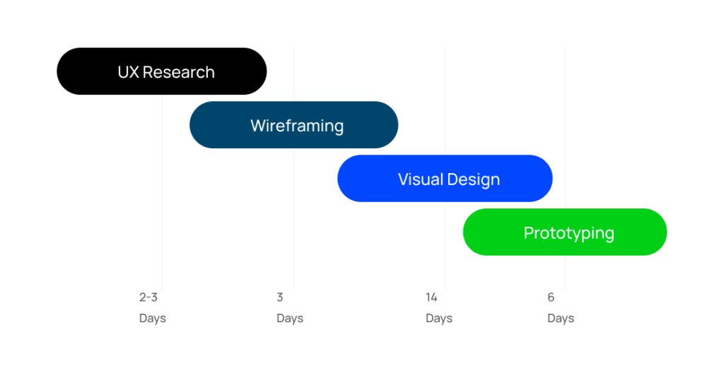
Solution
To address these issues, our team implemented the following changes:
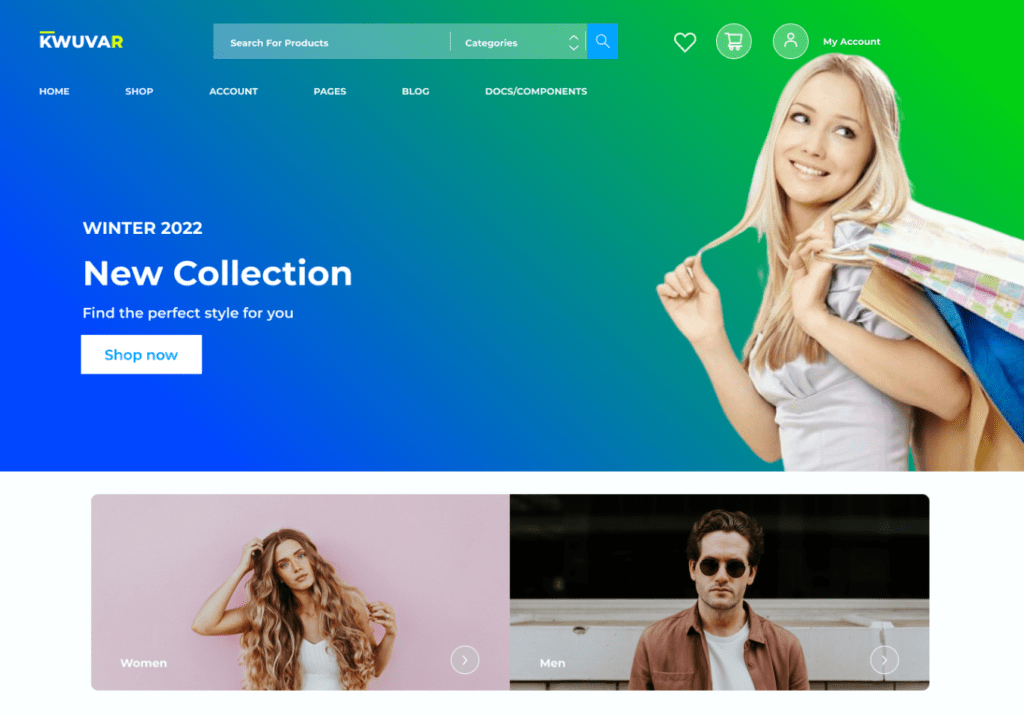
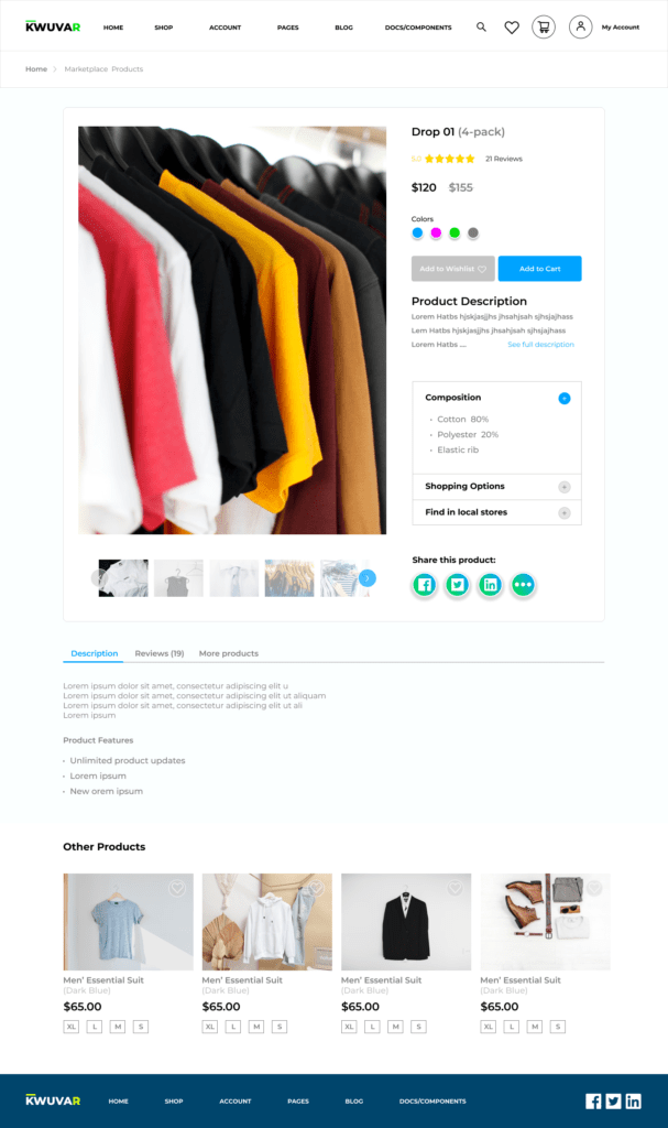
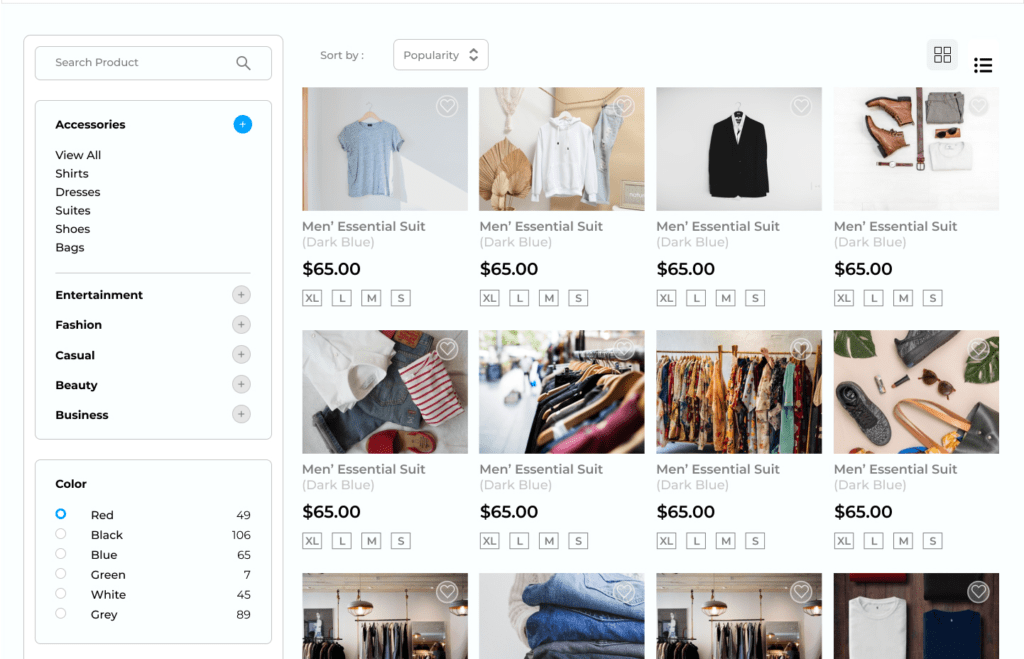
Improved Navigation: We redesigned the website navigation to make it more intuitive and user-friendly. We added a search bar and a filter option to make it easier for users to find specific products.

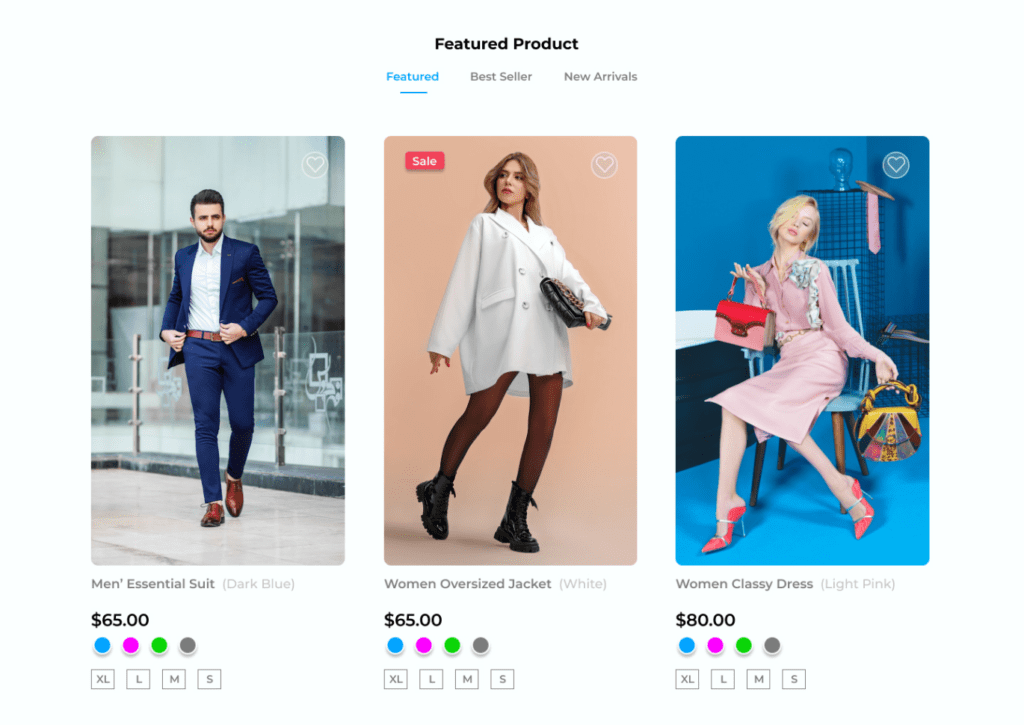
Enhanced Product Images: We improved the quality of the product images by providing high-resolution images and adding zoom functionality.
Personalization: We added a personalized recommendation feature that suggests products based on the user’s browsing history and preferences.
Results
As a result of these changes, the client experienced a significant increase in conversion rates and a decrease in bounce rates. Users were able to find the products they were looking for more easily and were more likely to make a purchase.
Conclusion:
Our team was able to help the client improve the user experience on their website, which led to increased sales and customer satisfaction. By focusing on improving navigation, product images, mobile optimization, and personalization, we were able to create a more user-friendly and engaging website that resonated with users.
