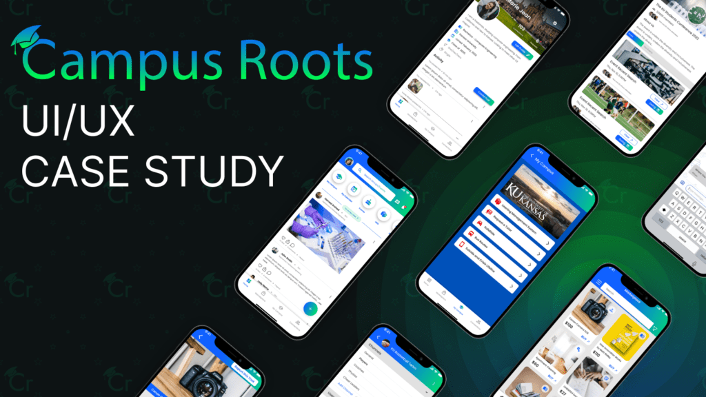
UI UX Design Case Study for College App – 2023
Overview
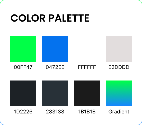
“My Campus Roots” is a cutting-edge mobile application designed to seamlessly integrate social, management, and ecommerce functionalities for college students. The primary color palette consists of blue and green, complemented by the Poppins font. The overarching goal of the app is to facilitate organizational efficiency, financial prudence, and community engagement within the college ecosystem. This case study delves into the meticulous UX design process employed to bring the My Campus Roots app to fruition.
Problem Statement
CCollege students grapple with multifaceted challenges, including time management, budget constraints, and social isolation. These issues are exacerbated by the evolving landscape of remote learning amid the COVID-19 pandemic, making it imperative to address the need for connection and support within the campus community.

UX Design Case Study for College App – 2023
Solution
The My Campus Roots app serves as a holistic solution, offering a unified platform for college students. Its social features foster peer connections and facilitate participation in clubs and organizations. Moreover, the app incorporates robust management tools such as a calendar, to-do list, and budget tracker. The inclusion of an ecommerce component further provides exclusive discounts on textbooks and essential school supplies.

Research
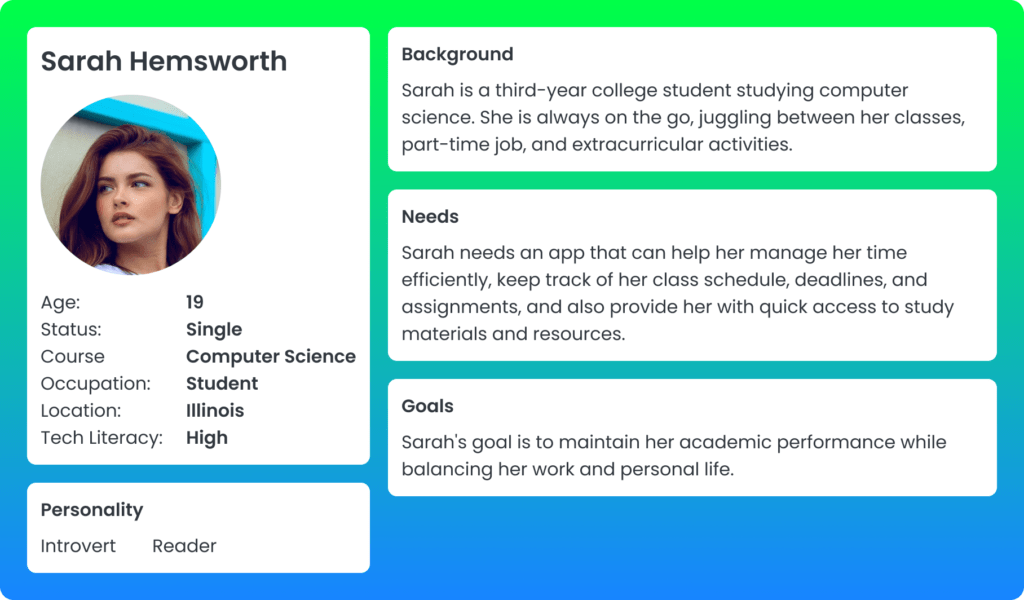
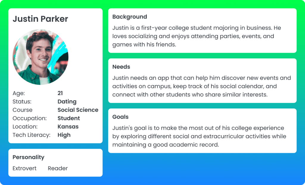
The design journey commenced with an in-depth understanding of the target audience. Rigorous user research, including surveys and interviews, was conducted to glean insights into the pain points, preferences, and behaviors of college students. A comprehensive analysis of existing market apps was also undertaken to identify gaps and potential opportunities.
Some Questions Asked
- How do you currently manage your academic schedule, deadlines, and assignments?
- What are some of the biggest challenges you face while balancing your academic, work, and personal life?
- How do you usually discover and participate in social and extracurricular activities on campus?
- What features would you like to see in a mobile app that would make your college experience more productive and enjoyable?
User Flows
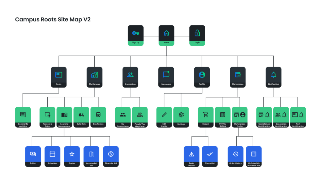
After analyzing the research data, we created user flows to map out the user journey through the app. This helped us identify the key features and prioritize them based on user needs.
UX Design Case Study for College App

Wireframes
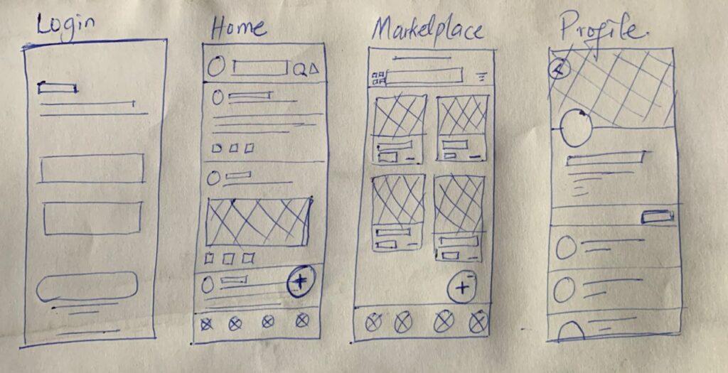
We then created low-fidelity wireframes to visualize the layout and content of each screen. We used the blue and green color scheme and Poppins font to maintain brand consistency.
Visual Design
Based on the user feedback, we refined the visual design of the app. We used custom icons, illustrations, and animations to enhance the user experience.

UX Design Case Study for College App
Prototyping
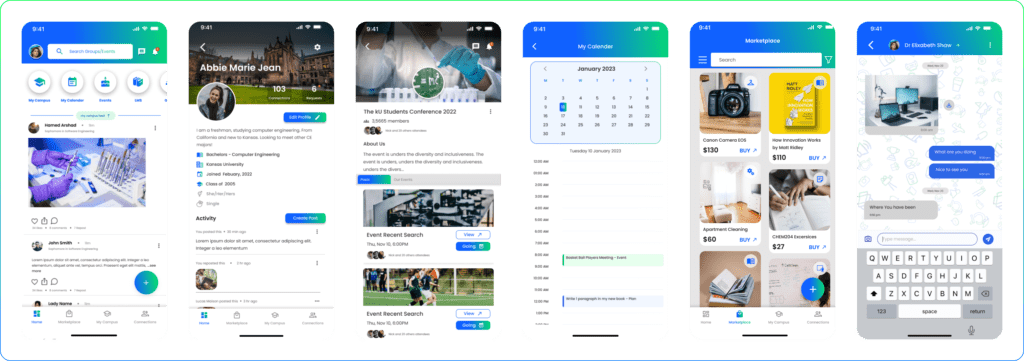
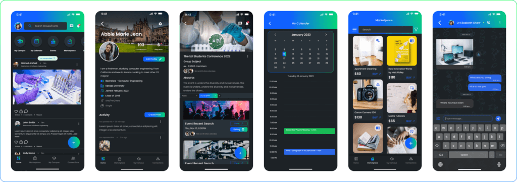
Once the wireframes were approved, we created high-fidelity prototypes to test the usability and functionality of the app. We conducted user testing sessions to gather feedback and make improvements. Both Light and Dark Modes are made.
Light Mode
Dark Mode
Conclusion
The My Campus Roots app stands as a comprehensive solution catering to the diverse needs of college students. The UX design process encompassed exhaustive user research, meticulous user flows, strategic wireframing, iterative prototyping, and refined visual design. The judicious use of the blue and green color palette alongside the Poppins font ensures brand consistency. The resulting app is not only user-friendly and visually appealing but also optimized for peak performance. We are confident that My Campus Roots will prove to be an invaluable asset, empowering college students to stay connected, organized, and on track in their academic journey.
UX Design Case Study for College App – 2023
Live Website
iOS App
Android App
Connect With Me:
Linkedin
