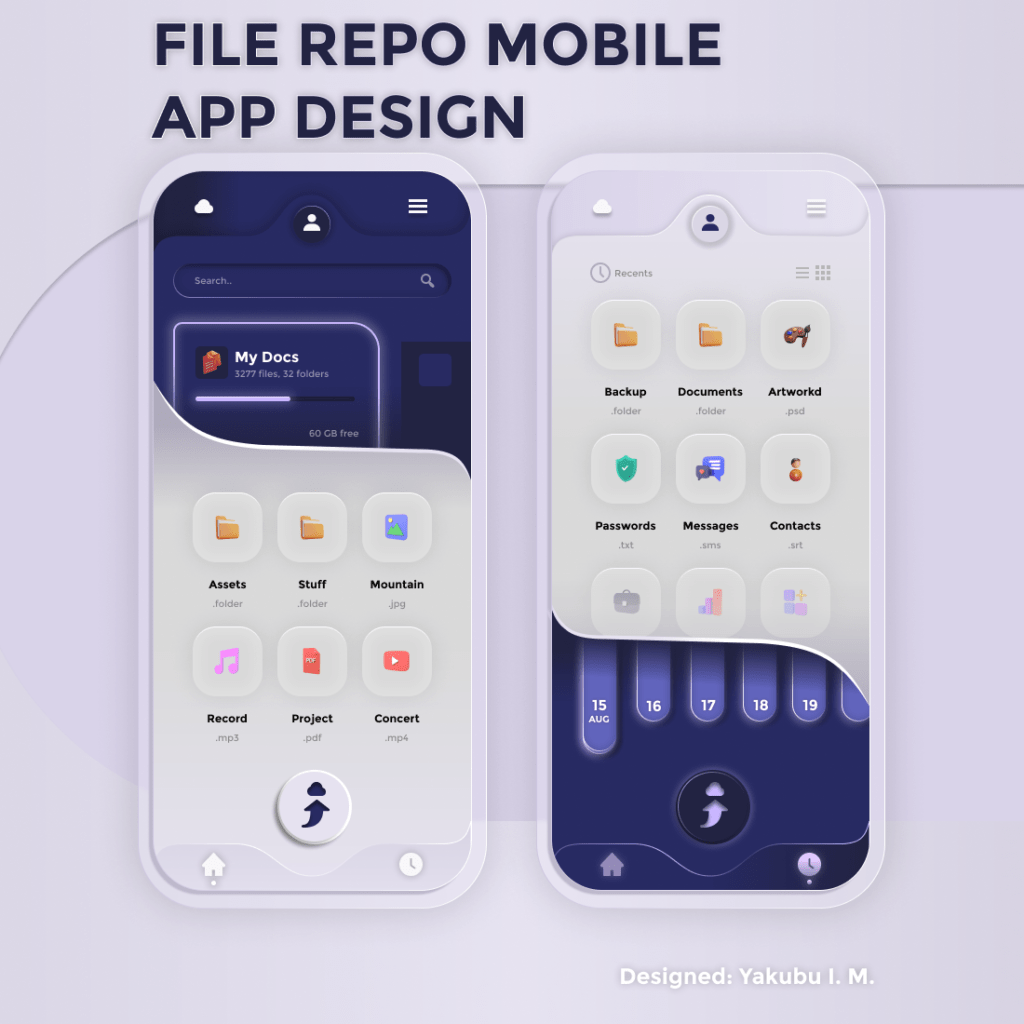
Why try Neumorphism in UI Design? Its Pros and Cons. It was not long ago that I developed an interest in the design trend that has risen heads over most of its counterparts. In this article I will like to walk you through the the pros and cons of this amazing design
Now, What is Neumorphism in UI Design?
For modern software, websites, and mobile apps, neumorphic design has gained popularity among UI designers and has become a common aesthetic choice. Neumorphism introduces mimicked physical attributes, such as shadows and textures to digital interfaces by drawing on elements of photorealism and 3D design. Let’s look at the history of neumorphic design to completely comprehend its effects.
Every design trend has advantages and disadvantages. Trends can give predictable design patterns new life when handled carefully, but problems can occur when they are pushed into systems where they don’t benefit consumers. To further comprehend the value of neumorphic design, let’s examine its advantages and disadvantages.

The Pros on Neumorphism in UI Design
Neumorphism is aesthetically straightforward, making it the perfect fit for digital products, which can have dozens, if not hundreds, of screens and design elements. The following are some benefits of simplicity in digital product design: Regardless of the number of screens a product has, it makes it simpler for designers to produce aesthetically pleasing experiences. It streamlines the procedure for developing, testing, and iterating new screens. Additionally, it aids designers in maintaining visual consistency as things change.
In addition to being straightforward, neumorphism’s realism can provide UI elements a more tactile appearance and possibly convey interactivity to users.
The Cons of Neumorphism in UI Design
Neumorphism has accessibility issues, despite being a widely adopted and popular fad. Neumorphic elements that are strictly monochromatic could cause issues for those who are color blind if designers choose to employ them. Additionally, because neumorphism relies on low contrast to generate its soft look, readability may be hampered and users may find it challenging to distinguish between buttons, icons, forms, and other crucial interface elements.
Conclusion..?
Just like I have developed an interest in this design trend, so does other designers. I hope this short piece will give them a hint at what the fuss is all about.
The less is more in Minimalist UX Design, find out why!
https://www.toptal.com/designers/digital-product-design/minimalist-ux-design-strategies
Click the button below to check more Design Blogs, Inspirations, and Tutorials from me
Some Sites I drive Design Inspiration From